Grey Espresso I & II
Grey Espresso I and II are coffee spaces designed to maximize simplicity and neutrality, highlighting the presence of each visitor. Even with the same coffee, each person experiences a unique sensation shaped by their own mood and perspective.
Grey Espresso I과 II는 사람의 존재를 가장 돋보이게 하기 위해 단순함과 무채색을 극대화한 커피 공간입니다. 같은 커피를 마시더라도 각자의 경험과 기분에 따라 색다른 감각을 선사하는 특별한 장소입니다.

Grey, where you shine
“The grey in this space isn’t just a color. It’s what lets each visitor’s presence really come alive.”
“이 공간의 회색은 단순한 색이 아니에요. 손님 한 사람 한 사람의 존재가 더 살아나도록 만들어주는 색이죠.”

Barista H
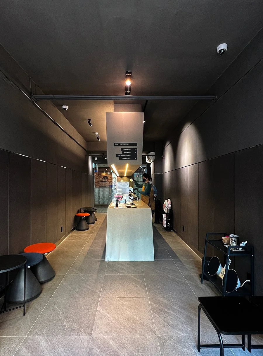
Grey Espresso I & II: Minimalist Spaces that Highlight Every Visitor
Grey Espresso I and II are coffee spaces run by the stylish barista Hong, designed with careful research into both coffee flavors and color aesthetics. From the very beginning, the concept and color palette were considered in tandem, and this philosophy continues across both locations.
The client believed that the reason for the space’s existence is the people who visit it. Each visitor comes with different moods and thoughts, experiencing the same coffee in unique ways. To highlight their presence, the space itself needed to remain simple and neutral.
Colors, forms, and even the floor plan are intentionally minimalistic, yet this simplicity is the result of deep consideration and thoughtful design.
Amid the intense coffee competition in Yeouido, both locations continue to be loved by many visitors.
Although both sites are approximately 10m x 3m in size, their layouts differ from each other.
Grey Espresso I과 II는 스타일리시한 바리스타 Hong이 운영하는 커피 공간으로, 커피 맛과 색감 연구를 바탕으로 설계되었습니다. 두 지점 모두 처음부터 색감과 공간의 컨셉을 함께 고민하며 이어져 왔습니다.
건축주는 이 공간을 찾는 사람들을 공간의 존재 이유라고 생각했습니다. 각 방문자가 자신만의 기분과 생각을 가지고 커피를 경험하기 때문에, 그 사람들의 존재감을 극대화하려면 공간은 단순하고 무채색이어야 한다고 판단했습니다.
색과 형태, 평면까지도 최대한 단순하게 설계되었지만, 그 단순함 속에는 많은 고민과 섬세한 배려가 담겨 있습니다.
여의도 한복판, 직장인들 사이의 치열한 커피 경쟁 속에서도 두 지점 모두 여전히 많은 사랑을 받고 있습니다.
면적은 두 지점 모두 약 10m x 3m이지만, 배치는 서로 다르게 구성되어 있습니다.


Efficient spaces often come from surprisingly simple floor plans. Yet, we also want spaces that have personality. True character can emerge not from a flashy layout, but from meticulous detailing. Especially in neutral-colored spaces, every small detail demands attention, teaching us the importance of precise planning and focused execution in construction.
효율적인 공간은 의외로 단순한 평면에서 나옵니다. 하지만 우리는 동시에 개성 있는 공간을 원하기도 합니다. 의외로 강한 개성은 화려한 평면이 아니라 섬세한 마감에서 나오기도 합니다. 특히 무채색 공간에서는 작은 디테일 하나에도 더 신경을 쓸 수밖에 없기 때문에, 면밀한 예측과 집중력 있는 시공 실행이 필요하다는 것을 배우게 된 프로젝트였습니다.


Small Details, Big Stories
Even in signs and signage, our design philosophy comes to life.
공간을 완성하는 사인과 간판 속에도 디자인 철학이 담겨 있습니다.