Joo Ok – Korean Contemporary Cuisine, Elevated
Joo Ok, the only restaurant elevated to two Michelin stars in Seoul 2022, redefines Korean contemporary cuisine through the artistry of fermentation and seasonal ingredients.
Chef Shin Chang-ho’s philosophy — that great dishes begin with cultivating great ingredients — is reflected not only in his cuisine but also in the space itself.
Designed by Ideacouch, the restaurant embodies quiet sophistication, allowing the beauty of Korean tradition to unfold in a modern, elegant setting.
2022 미쉐린 가이드 2스타로 승격된 주옥은, 발효와 제철 재료의 미학을 통해 현대 한식을 새롭게 해석합니다. “좋은 요리는 좋은 식재료를 기르는 데서 시작된다”는 신창호 셰프의 철학은 음식뿐 아니라 공간 전반에도 스며 있습니다.
아이디어카우치가 디자인한 주옥은 전통의 아름다움을 현대적이고 우아한 방식으로 담아낸 정제된 공간입니다.

Familiar roots, reimagined through a new lens
익숙한 뿌리를 새로운 시선으로 다시 보다

Elizabeth Keith
1887년, 영국 - 1956년
Crafted Duality
익숙함과 낯섦의 이중성
스코틀랜드 화가 엘리자베스 키스(Elizabeth Keith)의 눈으로 바라본 조선의 풍경은, 우리에게 익숙한 사물들을 낯선 표현 방식으로 담아낸 이방인의 시선 속 한국이었습니다. 그녀의 그림 속 한국은 분명 우리 것이지만, 동시에 어딘가 이국적으로 느껴집니다.
한국의 식재료를 사용하면서도 서양의 조리 감각을 닮은 레스토랑 ‘주옥’의 요리 역시, 우리가 익히 알고 있는 한식의 범주 안에서 새로운 낯섦을 경험하게 합니다. 외국인이 한국을 바라보며 느꼈던 그 생소함이, 역으로 우리가 주옥의 요리를 마주할 때 느끼는 감정과 닮아 있지 않을까 생각합니다.
더 플라자(The Plaza)에 들어선 주옥의 공간은 한국적인 재료의 ‘Originality’와 그 재료를 새롭게 해석하는 ‘Recreation’이 공존하는 무대입니다. 이곳은 주옥이 추구하는 **새로운 맛과 경험의 철학을 공간적으로 표현하는 하나의 ‘마당’**이 되고자 하였습니다.
This painting by the Scottish artist Elizabeth Keith captures Korea through foreign eyes — familiar Korean objects reinterpreted with a distinctly unfamiliar technique.
To Koreans, her depiction feels both recognizable and curiously exotic at the same time.
In much the same way, the cuisine of Joo Ok uses Korean ingredients but transforms them through a Western-influenced sensibility. The subtle unfamiliarity we experience when encountering these dishes perhaps mirrors how foreigners once perceived our own culture — familiar yet new.
The space of Joo Ok at The Plaza was conceived as a stage where the originality of Korean ingredients meets their creative reinterpretation. It serves as an open courtyard of taste and experience, embodying the restaurant’s philosophy of renewal and refinement.


JJOK JOOOK
JJOK JOOOK

“Joo Ok” means jewel and jade.
Inspired by the subtle jade hue within its name, we adopted a Jjok-bbit(=deep sky-blue tone), a color that evokes both the purity of jade and the serene essence of Korean identity. Applied across decorative elements throughout the space, this hue enriches the atmosphere and conveys the visual identity of Joo Ok.
주옥(珠玉)’은 구슬과 옥을 의미합니다.이 이름이 지닌 옥빛의 이미지를 담아, 한국적인 정서를 표현하는 **맑고 푸른 하늘빛 ― 쪽빛 ―**을 포인트 컬러로 설정하였습니다.이 색은 공간의 장식 요소 곳곳에 배치되어, 공간에 깊이와 생기를 더하고 동시에 주옥의 정체성을 시각적으로 드러내고자 하였습니다.
-
![]()
Plants of the Season
-
![]()
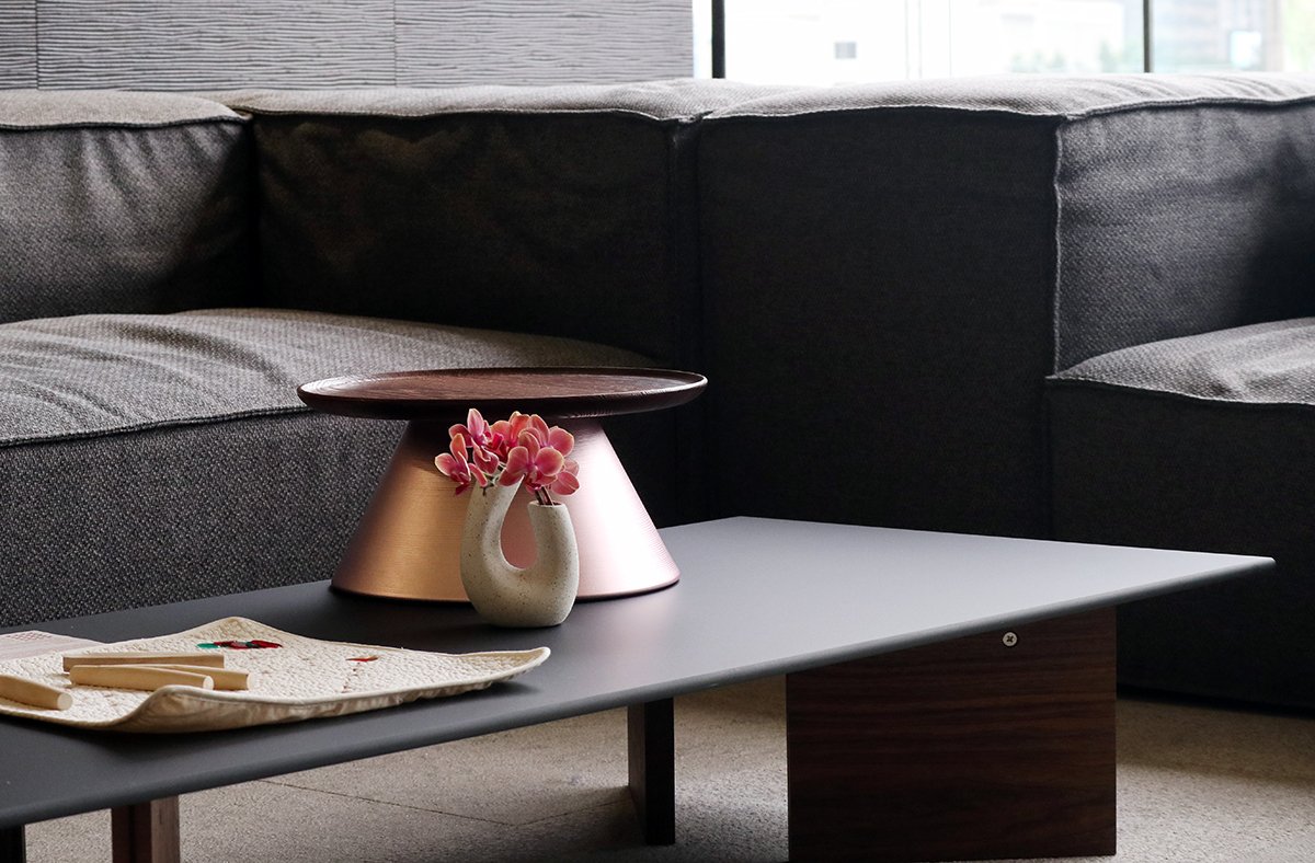
A Space Embracing Nature
-
![]()
Traditional Korean Low Table (Bansang)
-
![]()
Jook bit (Deep Blue) Fabric
-
![]()
Fermented Ingredients Exhibition


Where the essence of fermentation meets refined design
Beyond the Vessel
Architecture, at its core, is a vessel that holds meaning. When the content within is undefined, even the most refined form soon fades from memory. No amount of precision or beauty can sustain a space devoid of philosophy.
Joo Ok was a place where the chef’s convictions were expressed through space. His interpretation of the world through cuisine was extended through our interpretation in design. This project reaffirmed a simple yet essential truth —
that the essence of space lies not in its form, but in what it contains.
형태 너머의 본질
공간은 결국 무언가를 담는 그릇입니다.그 안에 담기는 내용이 분명하지 않다면, 형태의 완성도는 오래 기억되지 않습니다.아무리 정교한 설계와 아름다운 마감이라도, 그 공간을 채우는 철학이 없다면 금세 공허해집니다.
‘주옥’은 셰프님의 확고한 철학이 공간을 통해 자연스럽게 드러나는 장소였습니다.셰프님께서는 요리를 통해 세계를 해석하셨고, 저희는 공간을 통해 그 해석을 이어받았습니다.이 프로젝트는 공간의 본질이 결국 ‘내용’에 있다는, 단순하지만 근원적인 사실을 다시금 깨닫게 해준 소중한 경험이었습니다.